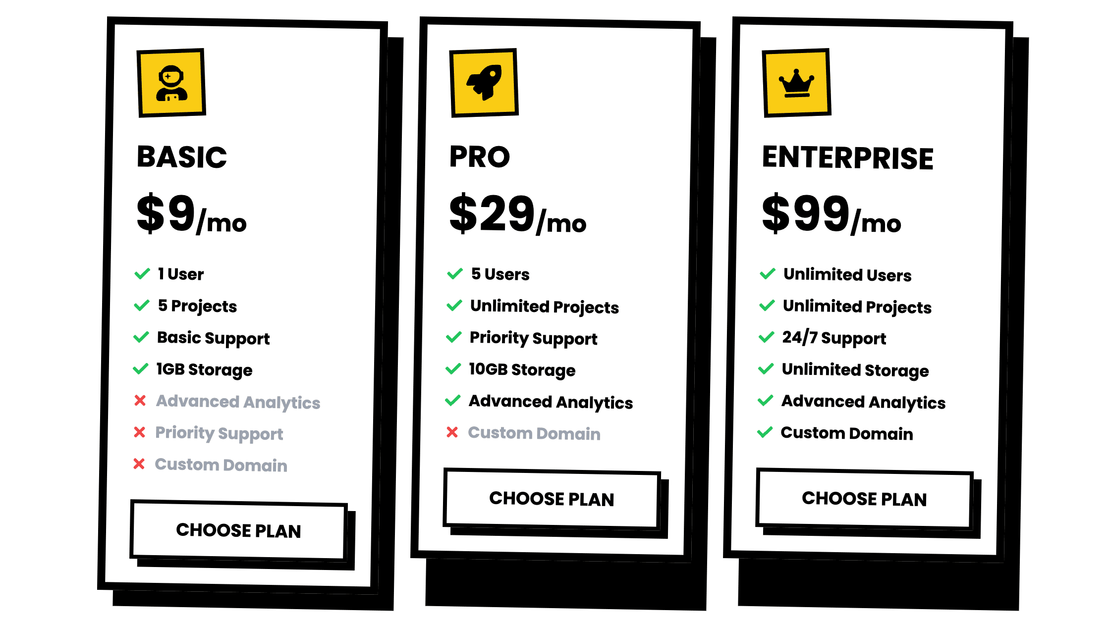
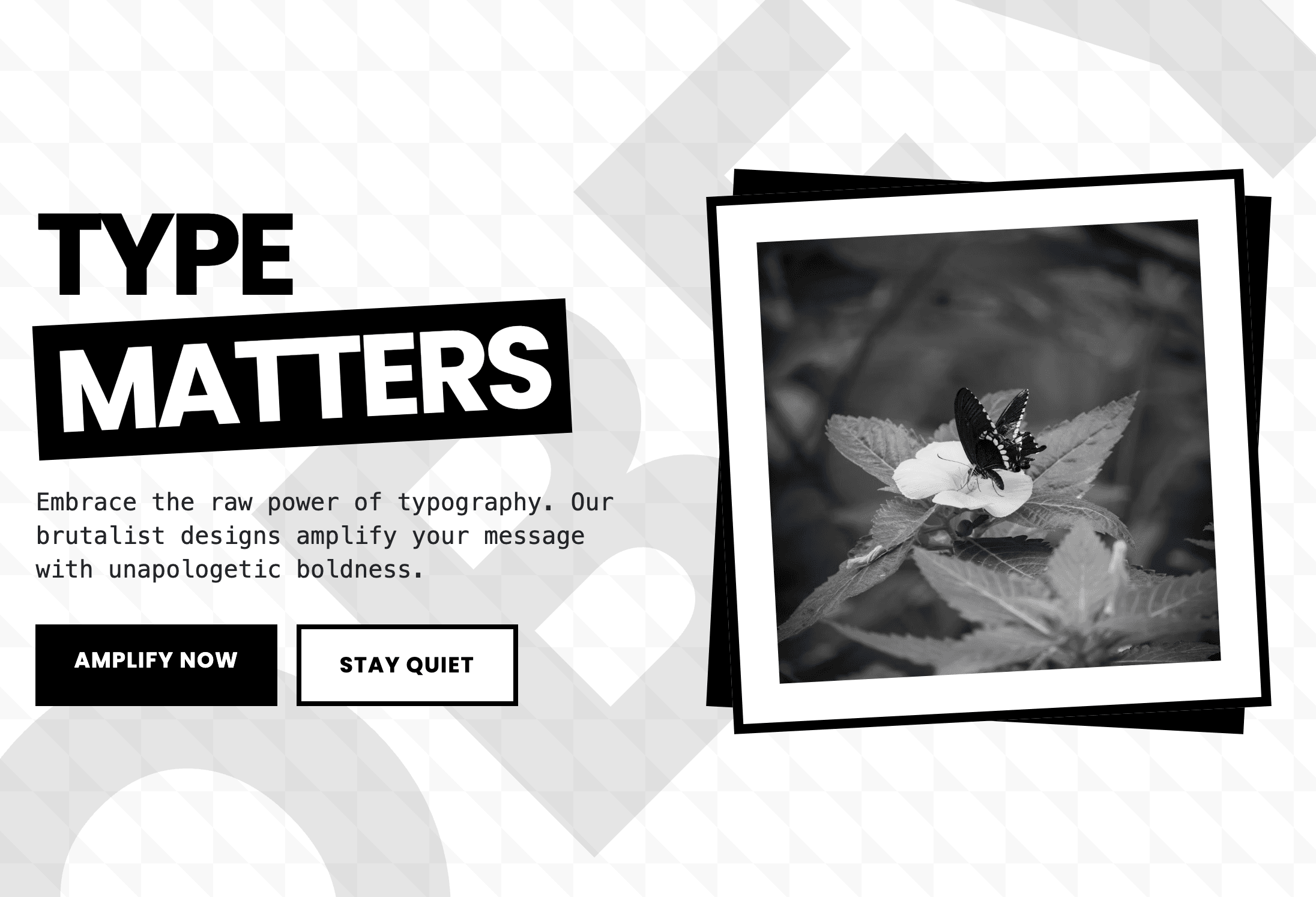
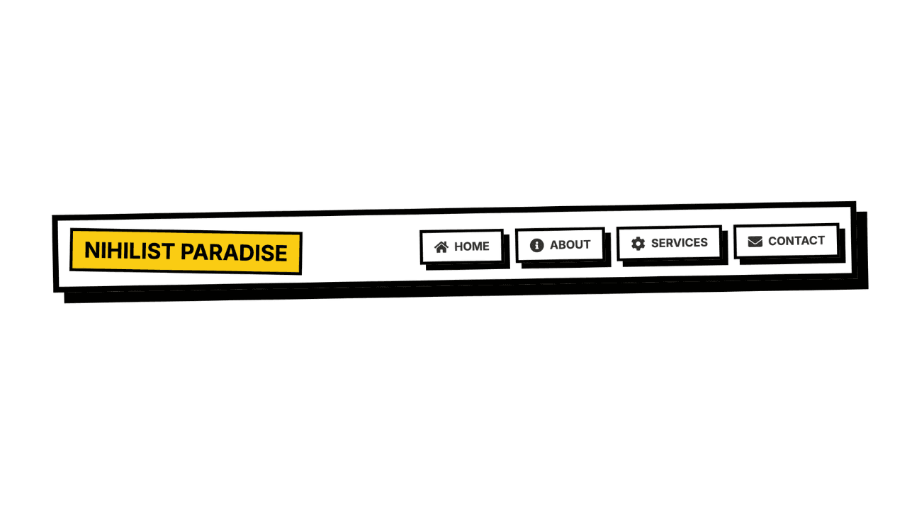
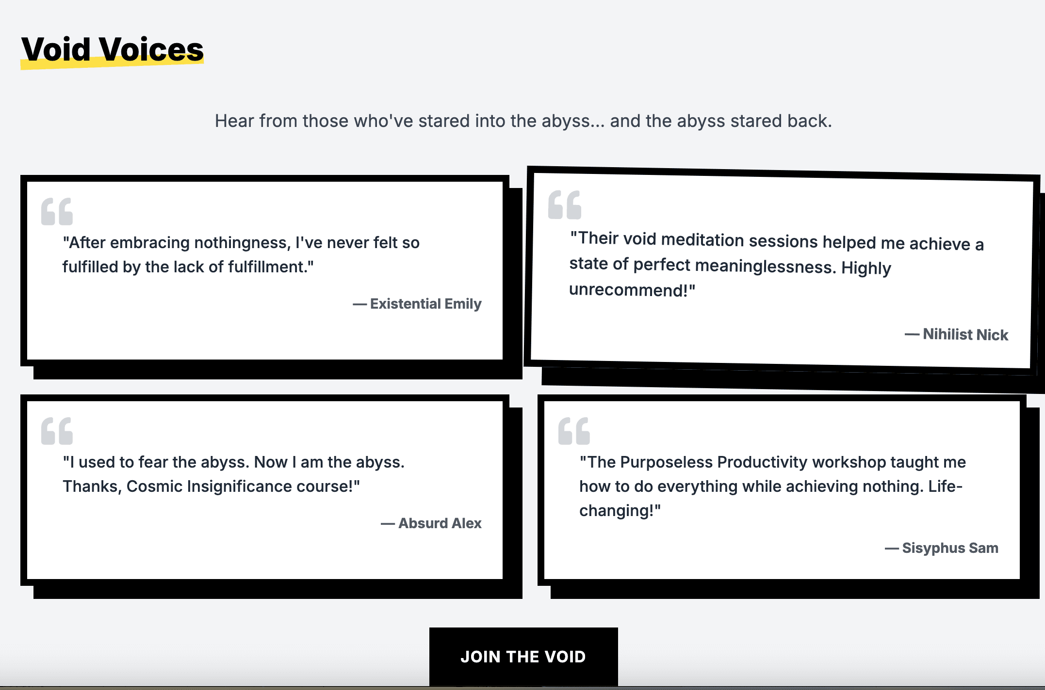
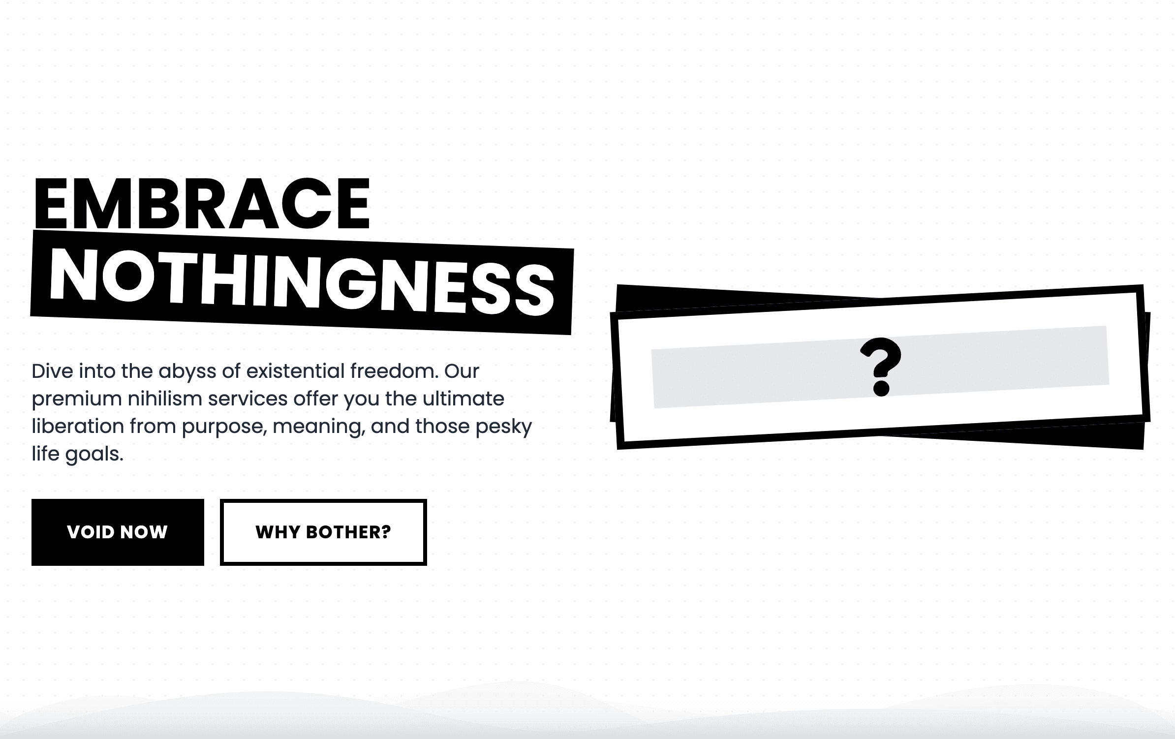
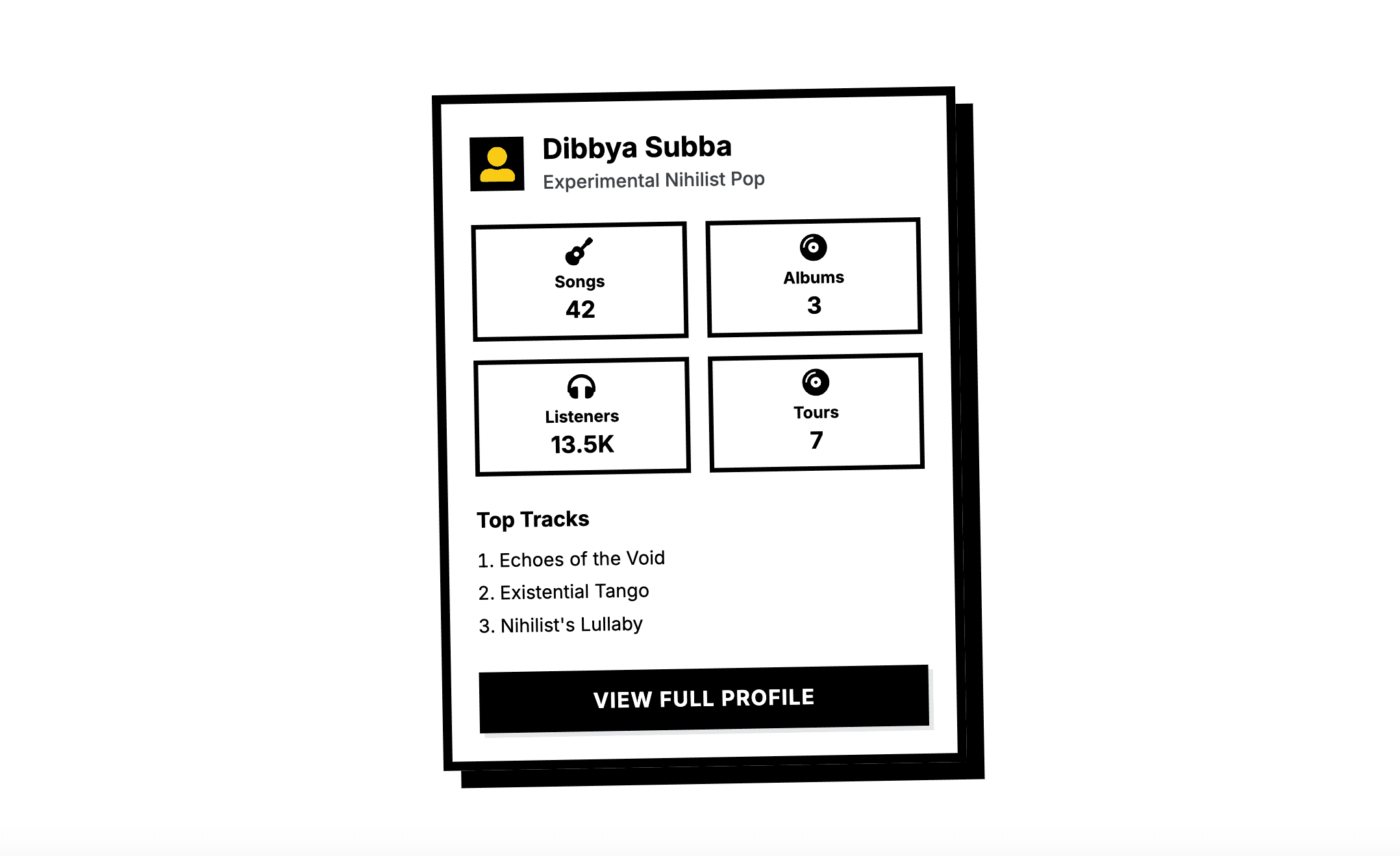
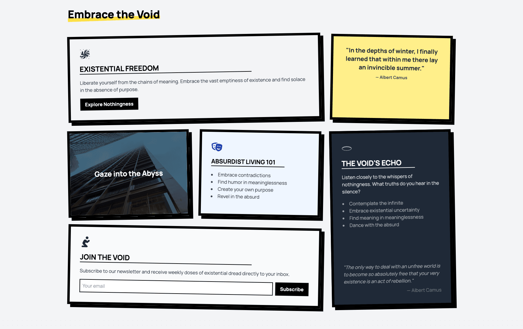
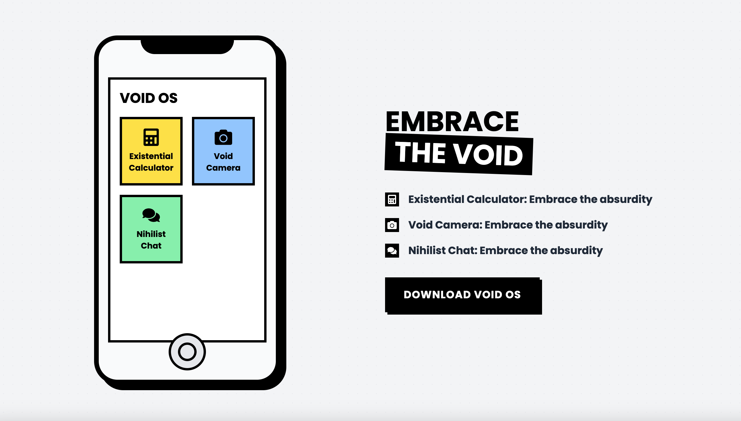
Forget sleek phone frames—this mockup goes all-in on blocky, bold lines and stark contrasts. Ideal for showcasing apps with zero fluff.
Forget sleek, forget subtle. This navigation bar gets straight to the point—four links, bold typography, and zero fluff. Navigate with attitude.
Words from those who’ve stared into the void—and lived to tell the tale. These testimonials cut through the noise with brutal honesty and stark design.
Content doesn’t need to be pretty—it needs to slap. This grid layout is sharp, text-heavy, and dripping with “Absurdist Living 101” vibes.
Buttons that mean business. Whether it’s alternative, warning, or straight-up brutal, these are for people who don’t mess around with UI fluff.
Notifications that don’t sugarcoat it. Brutalist toasts deliver the message loud and clear—no frills, just straight facts (or errors). You can’t ignore them, even if you try.
No gimmicks, no fluff—just raw, unapologetic pricing. Bold, minimalist, and brutally honest. Choose a plan or don't—your call.
No “soft-focus” fields here. Brutalist inputs are stark, clear, and brutally functional. Validation errors? They’ll hit you like a ton of bricks.
Same raw energy, but sideways. Horizontal bars, minimalist design, and enough edge to make your data impossible to ignore.
Dive into the void of existential design. This hero is all about embracing the absurd and asking the real questions: Why bother?
Contact forms with sass. Playful fields, bold social links, and an FAQ section that practically rolls its eyes if you don’t use it. Go ahead, send a message.
Introduce your team and mission with a clean, informative "Who Are We?" section. Highlight your commitment to revolutionising the Bitcoin ecosystem through accessibility and security, driving user trust.
Why have basic inputs when you can jack into the grid? Sleek, glowing, and totally ready to power up your forms.
Your e-commerce grid just got a glow-up. With hover animations, sassy stock indicators, and add-to-cart buttons that pop, these cards know they’re better than your old design.
Why settle for boring menus? Navigate your site like a boss with this neon-infused, retro-futuristic nav bar. Functionality meets cyber-cool aesthetics.
Want all your info to look fabulous in one playful grid? Bubblegum Bento is the sassiest way to organize stats, CTAs, and features. It’s giving ✨polished chaos✨.
Notifications but make them ✨extra✨. These playful pop-ups bring the party to your updates, so your audience will never miss a beat.
Soft, modern design with subtle shading & raised content area creating depth. Sleek rounded corners & muted colors.
Meet the squad that doesn’t play by the rules. Tilted images, quirky quotes, and cards that hover like they own the place—because normal team showcases are just sad.