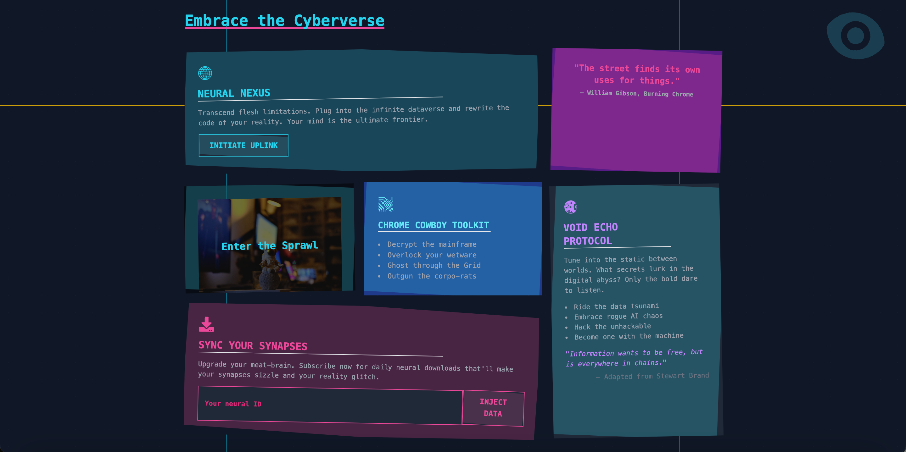
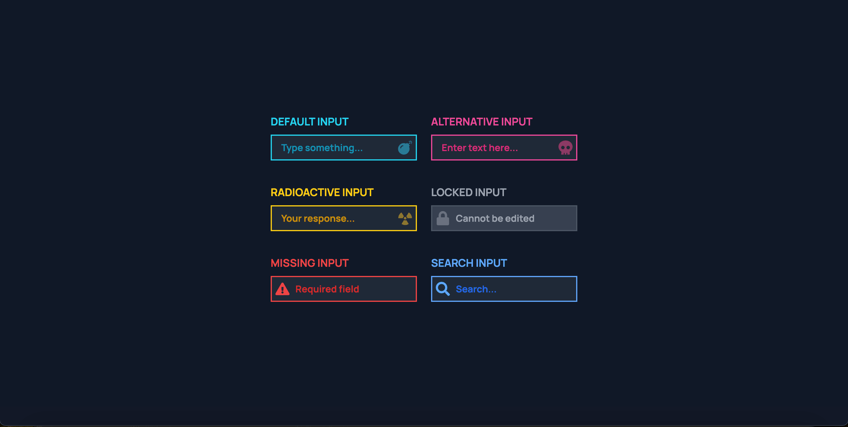
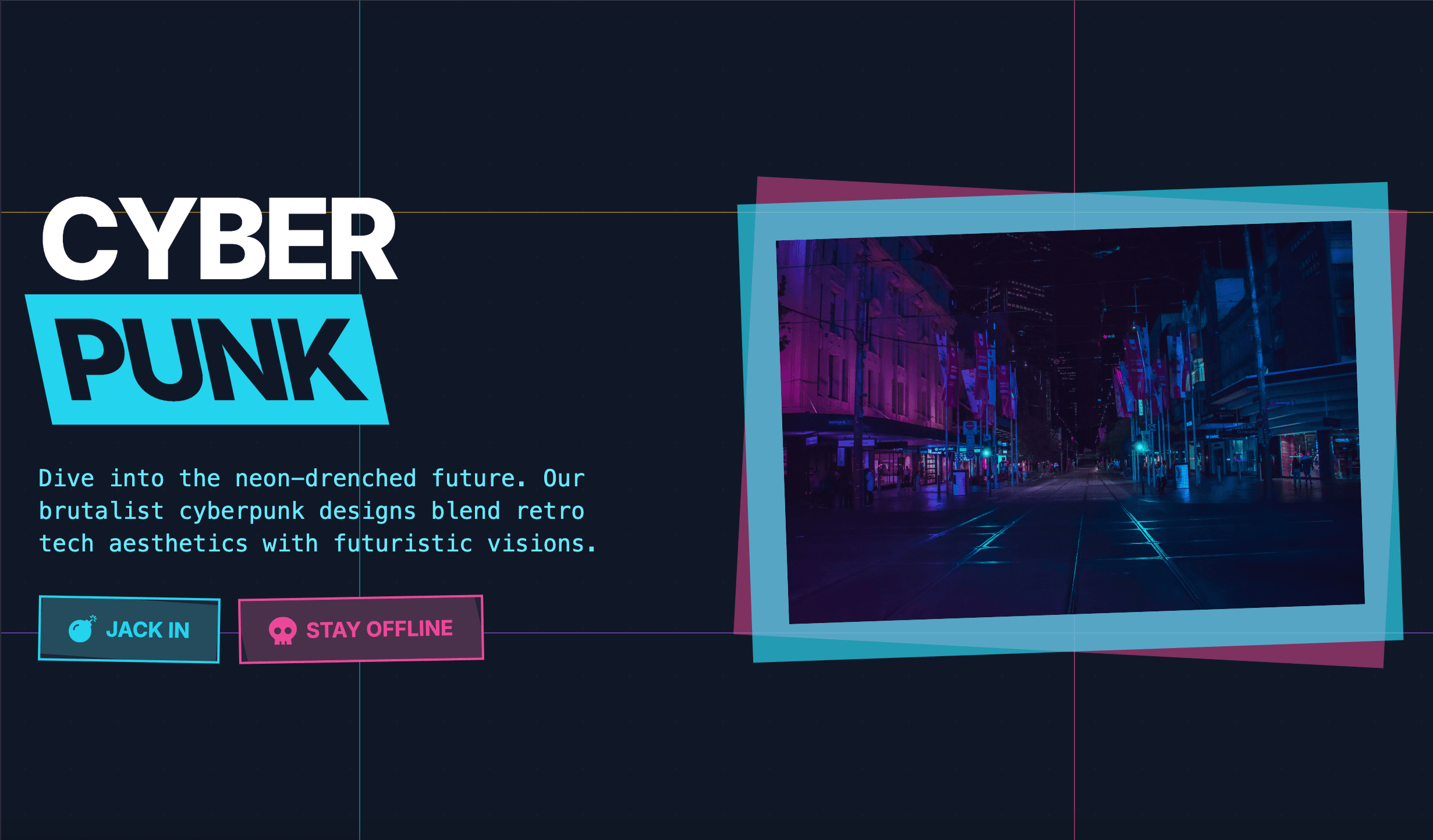
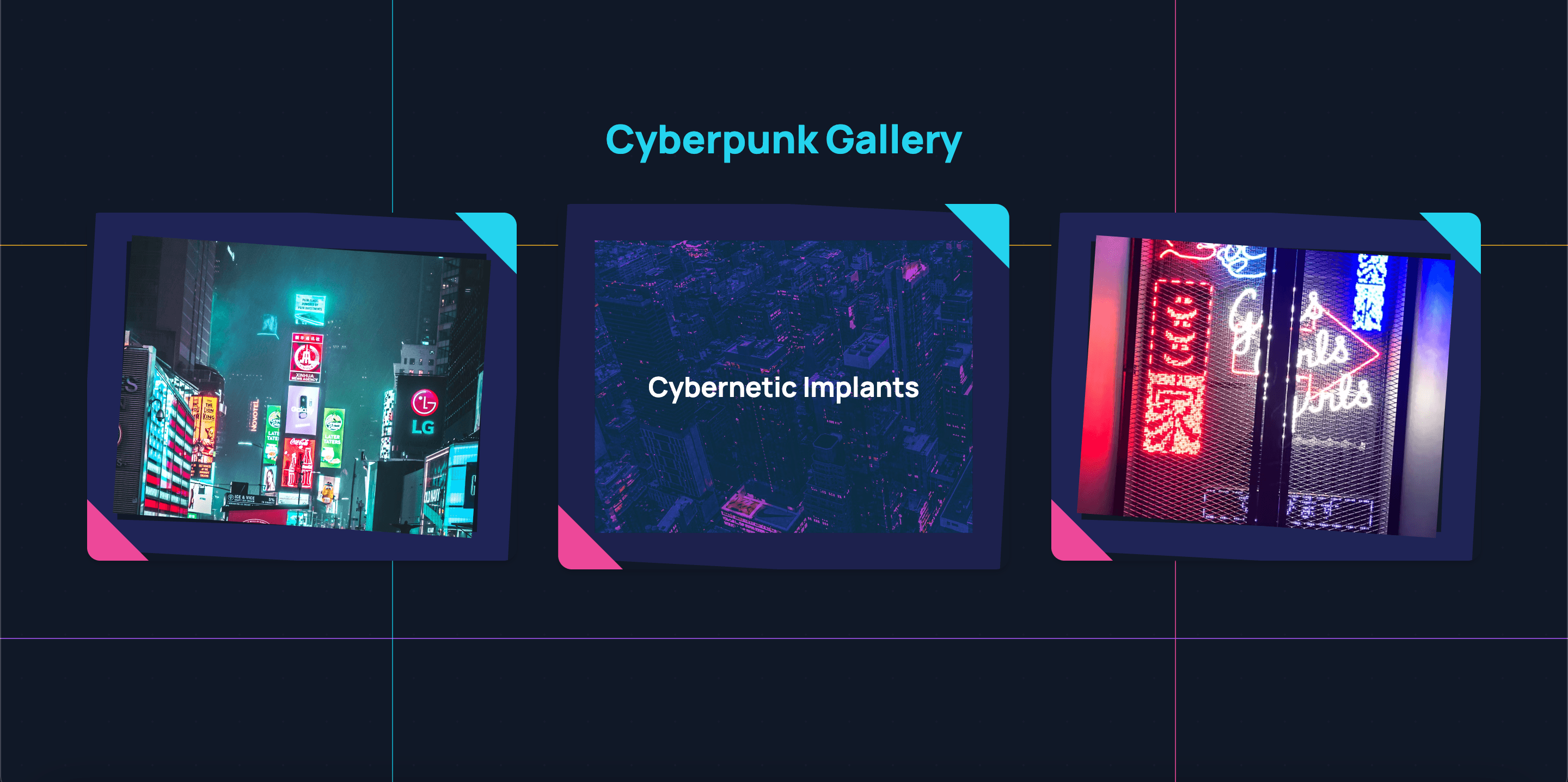
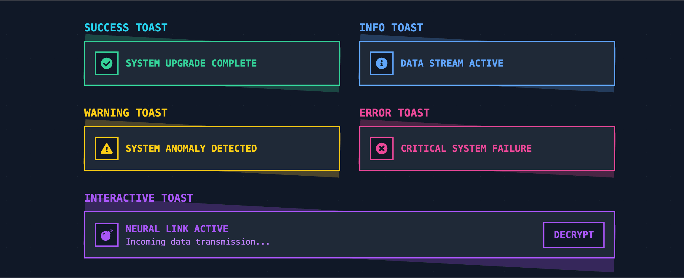
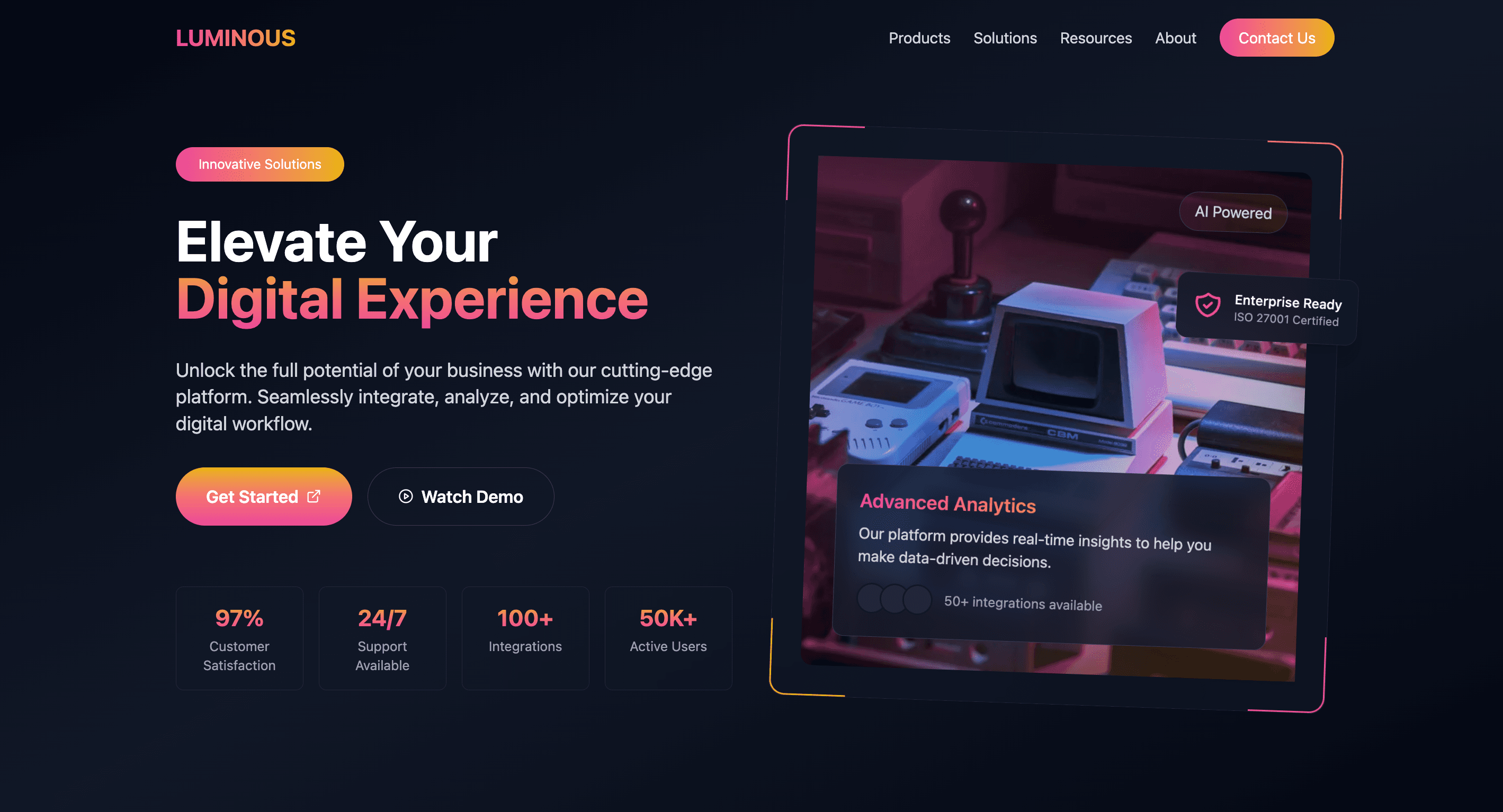
Organize your chaos with a Bento Grid straight out of 2087. Perfect for making your content look structured while still screaming cyberpunk vibes.
Click me, punk. These buttons are bold, glowing, and just a bit rebellious—exactly what your design needs to feel alive.
Forget dull sign-ups. This onboarding form is all about retro vibes and neon lines, making the process feel like an epic first step.
Forget sleek, forget subtle. This navigation bar gets straight to the point—four links, bold typography, and zero fluff. Navigate with attitude.
Show off those powerhouse features with style. AI strategies? Check. Data analytics? Double-check. This section is here to make your marketing look as smart as it claims to be.
Stats that slap. This metrics component combines neon-drenched visuals with practical layouts—perfect for those dashboard flexes.
Your principles, but make them glow. This layout is here to highlight your values in a way that’s as futuristic as your vision.
Why have basic inputs when you can jack into the grid? Sleek, glowing, and totally ready to power up your forms.
Pop-ups that pack a punch. These notifications are glowing, edgy, and impossible to ignore—because subtlety is overrated.
Show off your features like a true rebel. This futuristic layout pairs bold colors with structured design to give your audience a visual punch.
End on a high note with this glowing footer. Add links, socials, or CTAs in a layout that looks so good, no one will want to leave.
Sell your services like a boss. This neon-powered layout is all about attracting attention while keeping it crystal clear.
TYPE MATTERS, and this hero proves it. Stark, high-contrast, and unapologetically in-your-face. No gradients, no nonsense—just brutal honesty.
Showcase SaaS pricing with sleek neumorphic design. Engage users with smooth shadows and interactive tiers. Perfect for boosting conversions on pricing pages.
Forget boring ‘About Us’ pages—this one’s playful, quirky, and unapologetically fun. Because your brand deserves more than a dull paragraph.
Soft, modern design with subtle shading & raised content area creating depth. Sleek rounded corners & muted colors.
Dive into the void of existential design. This hero is all about embracing the absurd and asking the real questions: Why bother?
Floating content sections with neumorphic shadows. Light, desaturated hues & rounded corners for seamless fluidity.
"Elevate your brand!"—because that's what everyone says. But with this animated Venn diagram, we’re actually bringing creativity, strategy, and analytics together. Bold, bright, and way cooler than boring marketing fluff.