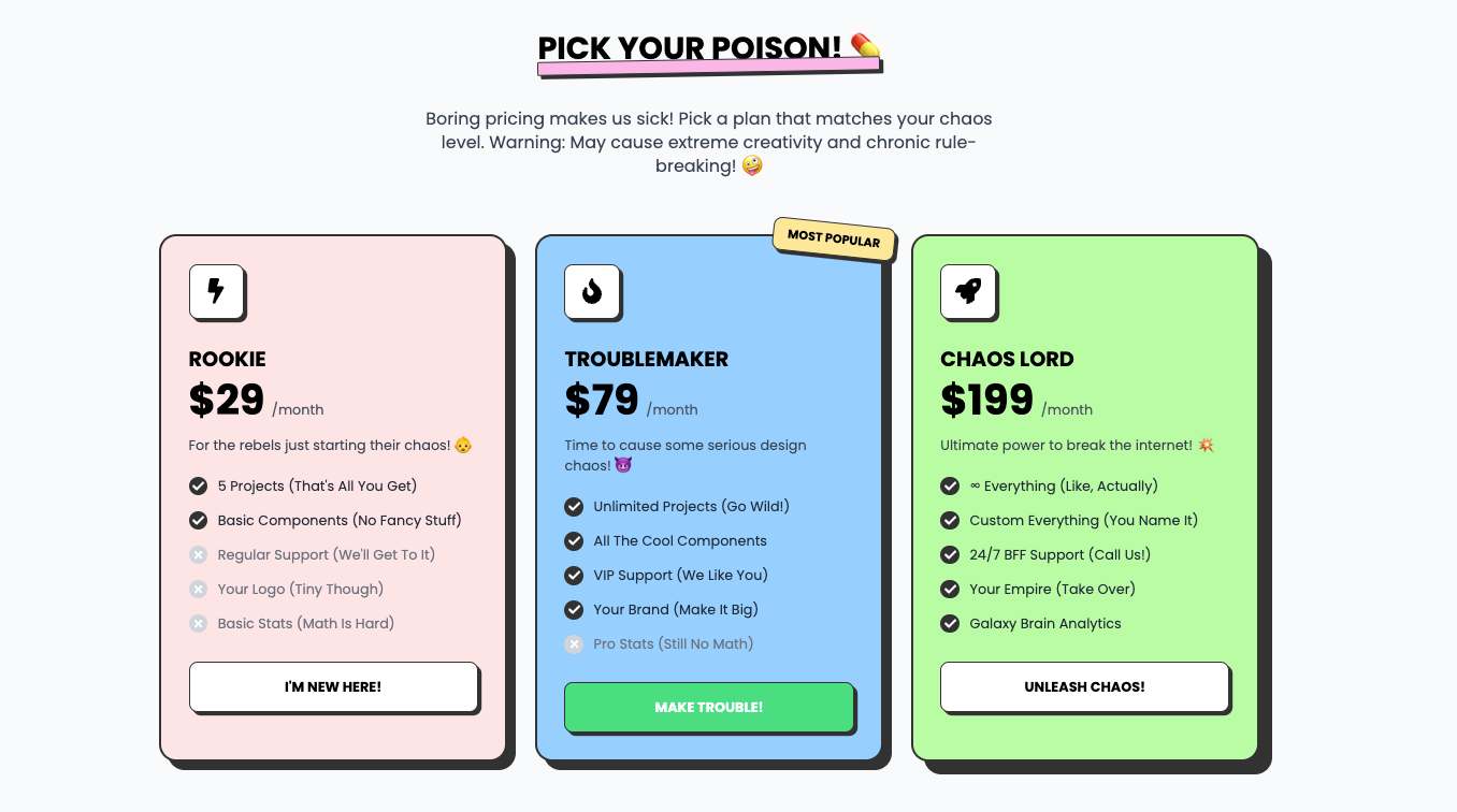
Pricing tables that don’t suck. Sharp, bold, and built to make your competition jealous. Take a seat, basic tables, this one’s got personality.
Toast alerts that demand to be seen. Success? Info? Warnings? Errors? Whatever it is, these toasts shout it loud and proud—subtlety not included.
Who needs boring old news when you can have the Neubrutalism News Paper? This component takes the classic newspaper look and gives it a rebellious twist.
Meet the squad that doesn’t play by the rules. Tilted images, quirky quotes, and cards that hover like they own the place—because normal team showcases are just sad.
Your e-commerce grid just got a glow-up. With hover animations, sassy stock indicators, and add-to-cart buttons that pop, these cards know they’re better than your old design.
Want conversions? This CTA doesn’t beg—it commands. Make your audience sign up or cry about it later. No hand-holding here.
A product page that’s as bold as your branding. Big buttons, loud calls-to-action, and layouts that scream, “Buy it or regret it forever!”
Who said heroes need to be horizontal? This bad boy flips the script, making sure your design stands tall and demands attention. Don’t like it? Too bad.
Analytics and stats with a personality. This admin bento grid serves up data with flair, making dashboards way less boring and way more you.
Playful? Yes. Sharp? You bet. Functional? Duh. This bento grid is the ultimate flex for making content look edgy and fun at the same time.
Introduce your stellar lineup in style. Showcase your team with a professional, gradient-infused layout that emphasizes collaboration and expertise.
Show off those powerhouse features with style. AI strategies? Check. Data analytics? Double-check. This section is here to make your marketing look as smart as it claims to be.
Notifications but make them ✨extra✨. These playful pop-ups bring the party to your updates, so your audience will never miss a beat.
Why settle for boring menus? Navigate your site like a boss with this neon-infused, retro-futuristic nav bar. Functionality meets cyber-cool aesthetics.
End on a high note with this glowing footer. Add links, socials, or CTAs in a layout that looks so good, no one will want to leave.
Content doesn’t need to be pretty—it needs to slap. This grid layout is sharp, text-heavy, and dripping with “Absurdist Living 101” vibes.
Show off your features like a true rebel. This futuristic layout pairs bold colors with structured design to give your audience a visual punch.
No “soft-focus” fields here. Brutalist inputs are stark, clear, and brutally functional. Validation errors? They’ll hit you like a ton of bricks.
Want all your info to look fabulous in one playful grid? Bubblegum Bento is the sassiest way to organize stats, CTAs, and features. It’s giving ✨polished chaos✨.