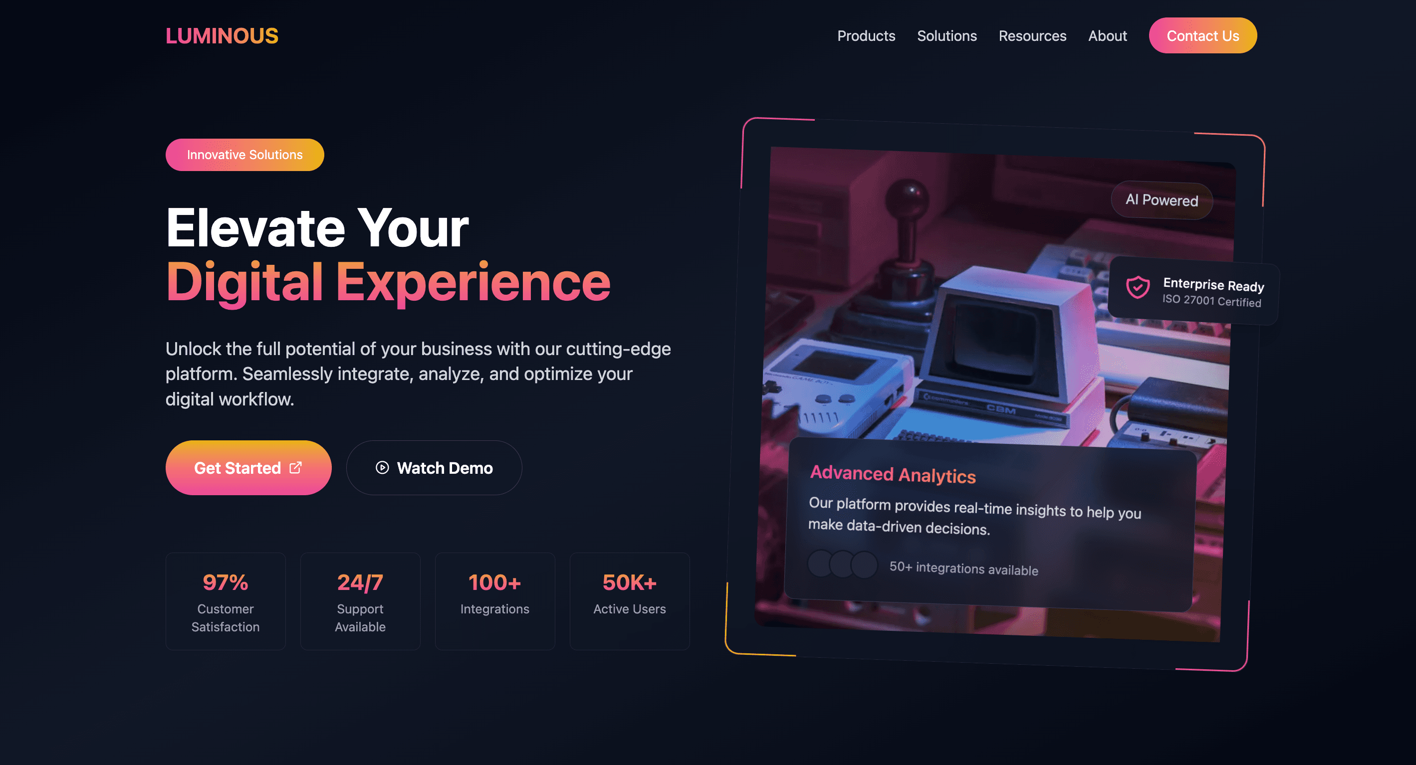
Same raw energy, but sideways. Horizontal bars, minimalist design, and enough edge to make your data impossible to ignore.
Forget sleek phone frames—this mockup goes all-in on blocky, bold lines and stark contrasts. Ideal for showcasing apps with zero fluff.
Dive into the void of existential design. This hero is all about embracing the absurd and asking the real questions: Why bother?
TYPE MATTERS, and this hero proves it. Stark, high-contrast, and unapologetically in-your-face. No gradients, no nonsense—just brutal honesty.
Notifications that don’t sugarcoat it. Brutalist toasts deliver the message loud and clear—no frills, just straight facts (or errors). You can’t ignore them, even if you try.
Forget sleek, forget subtle. This navigation bar gets straight to the point—four links, bold typography, and zero fluff. Navigate with attitude.
Content doesn’t need to be pretty—it needs to slap. This grid layout is sharp, text-heavy, and dripping with “Absurdist Living 101” vibes.
Buttons that mean business. Whether it’s alternative, warning, or straight-up brutal, these are for people who don’t mess around with UI fluff.
No “soft-focus” fields here. Brutalist inputs are stark, clear, and brutally functional. Validation errors? They’ll hit you like a ton of bricks.
No chatbots pretending to be your friend here. Brutalist AI Chat is direct, functional, and brutally efficient at delivering what you need—no emojis required.
Slide into our inbox 💌. This form isn’t just functional—it’s flirty, fun, and designed to make connecting with your audience way too easy.
Introduce your team and mission with a clean, informative "Who Are We?" section. Highlight your commitment to revolutionising the Bitcoin ecosystem through accessibility and security, driving user trust.
Stats that slap. This metrics component combines neon-drenched visuals with practical layouts—perfect for those dashboard flexes.
Toast alerts that demand to be seen. Success? Info? Warnings? Errors? Whatever it is, these toasts shout it loud and proud—subtlety not included.
Floating content sections with neumorphic shadows. Light, desaturated hues & rounded corners for seamless fluidity.
Complete your site's sleek look with the Glass Footer component. Provide key navigation links and company info in this essential, glossy footer section.
Why settle for boring menus? Navigate your site like a boss with this neon-infused, retro-futuristic nav bar. Functionality meets cyber-cool aesthetics.
Showcase SaaS pricing with sleek neumorphic design. Engage users with smooth shadows and interactive tiers. Perfect for boosting conversions on pricing pages.
Introduce your site with the Clean Minimalism Hero component. Designed with Tailwind CSS, it offers a clean, responsive layout, perfect for making a striking first impression.